top of page
UX Case Study
Personalized News Concierge
HottakeAI streamlines news consumption by analyzing content from user-selected news sources and topics. It offers text and audio summaries, allowing users to access their preferred news via different channels such as email, Telegram, etc.
HottakeAI addresses the problem of time-consuming news browsing by delivering concise, tailored news reports.
The platform simplifies news discovery and consumption, providing a more efficient experience.

-
Research the Industry, trends and competitive analysis
-
Conduct user research to validate Problem hypothesis
-
Design Landing Page
-
Define user journeys inside platform
-
Create Wireframes of the platform
-
Conduct user research to validate Solution
-
Design the user interface
-
Iterate on the design
Responsibilities
Design Timeline

First Challenge
(Lack of domain specific knowledge)
I began working on HottakeAI starting from the Idea Stage. When we started this project I had little to no background in AI and machine learning (ML).
One of my key responsibilities was to conduct research on industry trends and perform competitive analysis. To handle that responsibility I needed to pass through sleepless nights of learning challenges. I decided to become a superhero and learn AI/ML concepts myself. Otherwise, I would end up as an imposter.
Through consistent effort and lots of Courses/Googling/ChatGPT-ing, I developed a solid understanding of the AI/ML landscape. Later that allowed me to apply this knowledge to design solutions aligned with industry standards and user needs.
The main question. Why?
Before starting the project and creating the user journey we needed to get the answer for the main question. And we started with "WHY?" :).
Understanding the 'why' was crucial. Our research and discussions guided me in designing the user journey. To my surprise, conversations with individuals closely aligned with our possible customers revealed that the time spent reading the news was just as important as the channels and methods through which they received the information.
The Answers:
Our User Persona values their time and seeks quick, efficient ways to stay informed. They are looking for news that's not only relevant but also presented in a time-saving format within a familiar platform (Mail, Telegram) without the need to browse multiple sites.
Conclusion:
We needed to solve three problems.
-
Summarize big chunks of news
-
Unify news from multiple sources
-
Deliver it to the customer by the most preferable channel
“Sell it before you make it”, creating the Landing & user Journey
After initial research 2 parallel processes started.

1st I’ve started designing the Landing Page
On a Landing, we wanted to show the whole experience and allow some beta usage feeling even before registering to app.

2nd I’ve started working on User Journey
Aim of User Journey design was to make a very straight forward flow, where user will be guided from “registration” to “configuration completed” state.
We ended up with the following Sitemap


We already knew that users will not spend lot’s of time figuring out how our platform works and digging into configurations. Hence our decision was to start configuration right away as part of onboarding.
It was time to make the Landing page that would give a conversion. Since the goal was to give full experience demo before even registering I’ve included a ready example into landing, that later appeared the most clicked element on the Landing.
Home page's design of Landing
.png)
Other screens of Landing

Wireframes and Solution Validation
Since the onboarding (configuration) and homepage with a listing of configurations was the bare MVP all the stakeholders agreed on. Having this done, I needed to validate if it was enough to solve the problem we wanted to solve. As a first step, we did wireframes and started discussions with the engineering team. It took several days to ensure all the necessary inputs were included and the wireframes had all the functionalities for developers to build on. Next, we made simple form inputs with Front-End engineers and shared them with existing contacts from the first interview. After submission, we used manual steps to configure and compose news for them to see if they liked and read it. Receiving good comments was a green light for engineers to build the backend and for me to create a “breathtaking” UI :D

Some design system components

Color palette

Primary buttons
Secondary buttons

Input fields
Multi select fields


Alerts

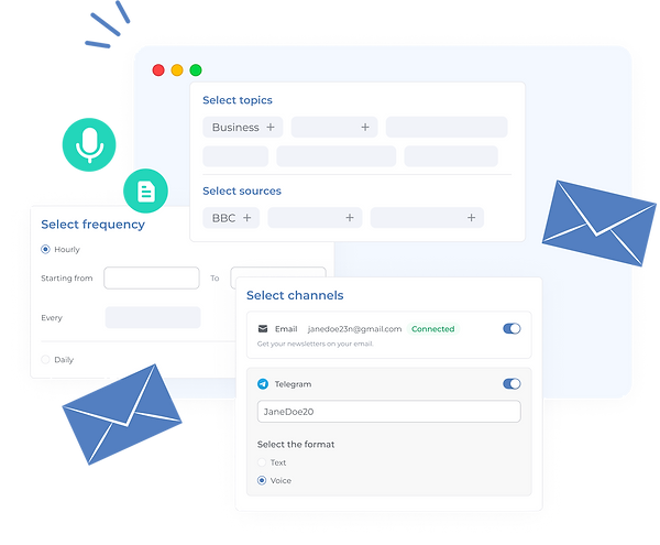
“BREATHTAKING” Design of the user interface

After design iterations.
-
Initially we were composing a text in HTML, that was emailed to our customers. That looked like this: <<Email template>>. Soon after seeing the usage by our early birds we figured out that the experience is yet complicated and includes reading that doesn’t fully solve the pain and need of spending time, focused on reading news. Hence on second iteration we’ve added an audio option.
-
Though our initial assumption that users will leave after configuring was real, we wanted to keep some activity inside the app, hence we’ve changed the homepage from showing just the configured news to a listing of already generated outcomes from configurations, creating some kind of feed.
-
Soon we figured out that most of websites were from mobile phones... The creation of mobile view was ”INEVITABLE”

bottom of page